Staking, rebuilt around user intent.
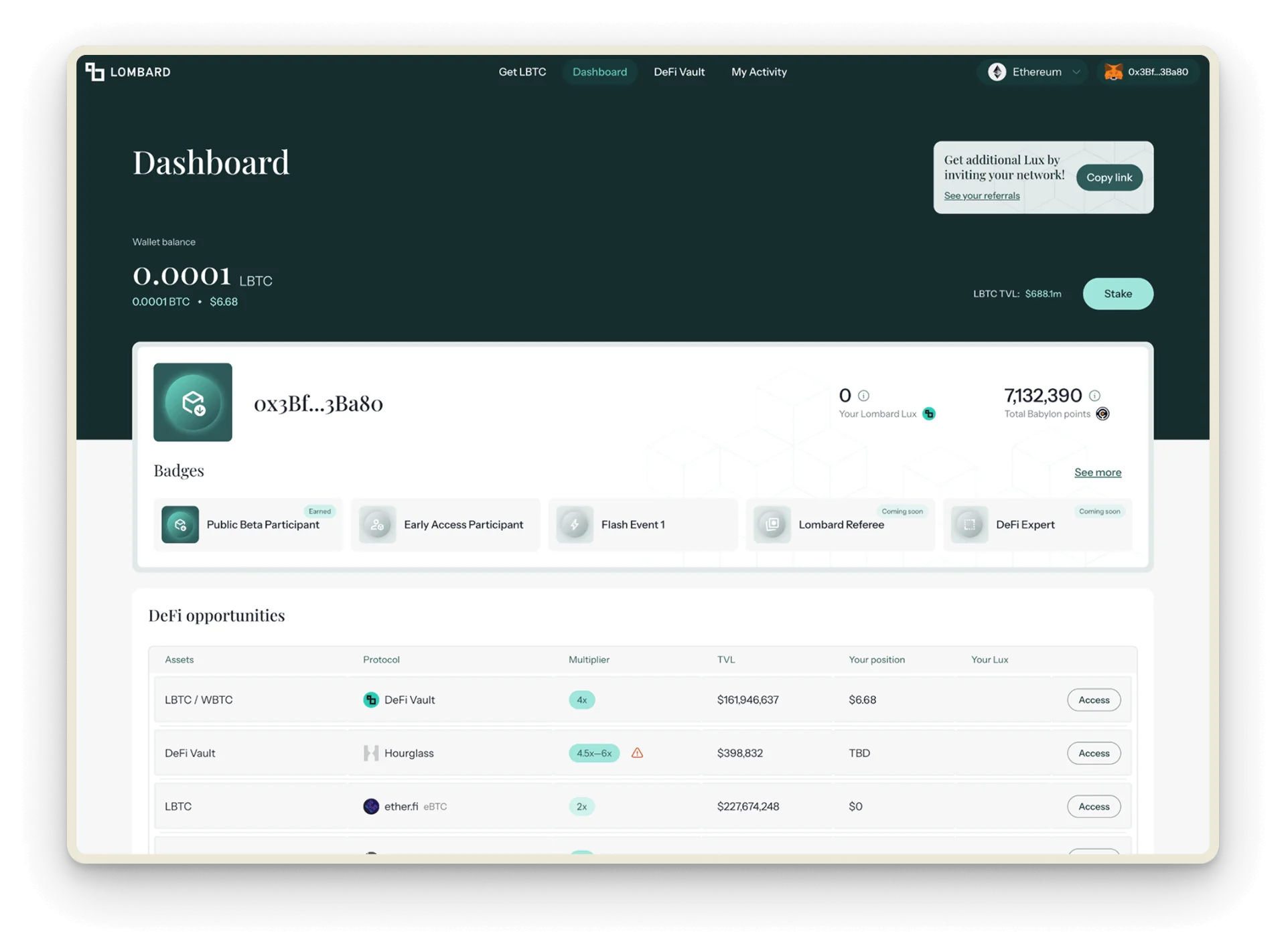
Lombard had real product–market fit, but a dashboard built outward from launch incentives instead of inward from user intent. Rebuild it around what users actually came for.
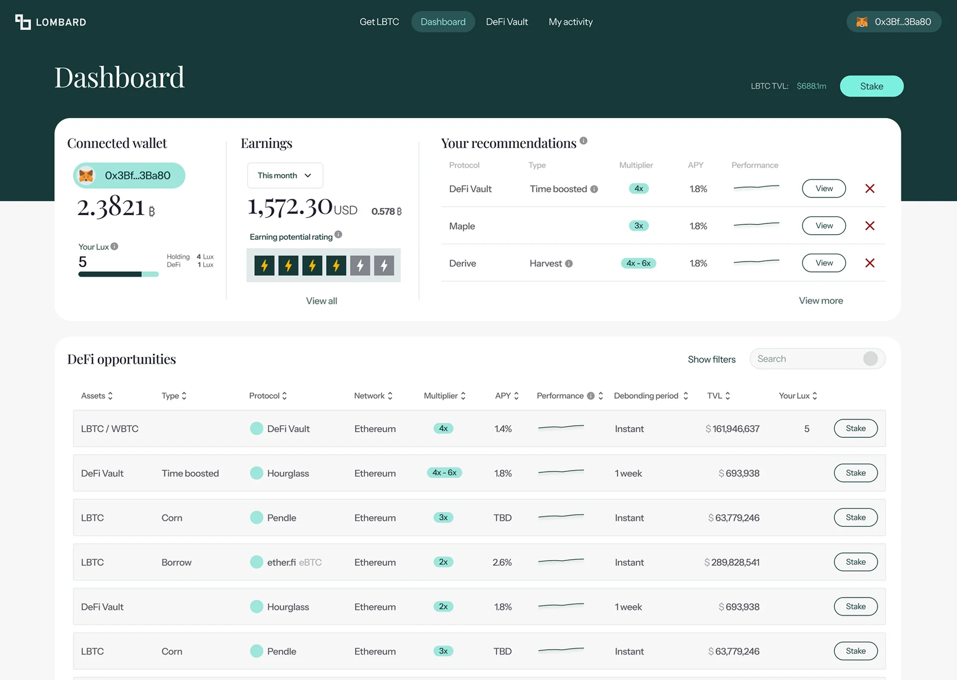

A dashboard built around launch incentives, rebuilt around what users actually came for: their money.
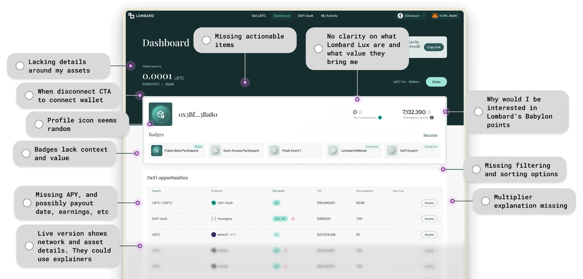
Lombard had real product–market fit, but four incentive systems competed for attention before users could find their own balance. No explanations, no way to sort the opportunities, and no view of what they had staked or what it was earning.
Competitor teardowns, Nansen on-chain data and user interviews all pointed the same way: the audience was sophisticated and fee-sensitive, and wanted clarity over gamification. So earnings moved to the top, the opportunity table became personal recommendations, and incentives surfaced only where they had earned attention.
- Dashboard audit eleven friction points on one screen
- Research synthesis teardowns, Nansen data, user interviews
- Earnings-first overview balance, monthly earnings, earning potential
- Personal recommendations three options, with a path to view all
- Decision-grade table APY, trend, debonding, multiplier, Lux
- Contextual incentives badges, points and referrals, lower down
What we achieved
Figures reported by the client after launch.Users staked across more opportunities, exploring new positions with context.
Total staked volume rose as earnings took priority over incentive noise.
Users kept their BTC staked longer once debonding was up front.
Adoption grew after the redesigned dashboard shipped.
Users didn’t have to learn a new dashboard. They finally had one that learned them.
Reorganising the surface around earnings, recommendations, and decision-grade data moved every metric that mattered — and shifted behaviour, not just clicks. Staking diversity +86%, staking amount +18%, staking duration +71%, user count +16%.